A user-centered approach to menopausal well-being
Skills: User interviews, Usability testing, Personas, UI design
My role
User researcher
UX designer
UI designer
Timeline
July- August 2023
5 weeks
Deliverable
High fidelity prototype
Note: Since the deliverable for this project was only a high-fidelity prototype, we didn’t implement this design. See next steps to see how we would move forward to measure KPIs.
User Interviews
Learn what menopausal women seek out when they are traveling
Understand how menopause impacts their travel experience
learn how they have felt using other travel planning methods
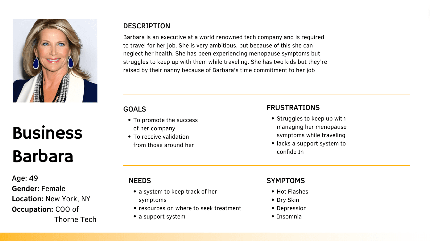
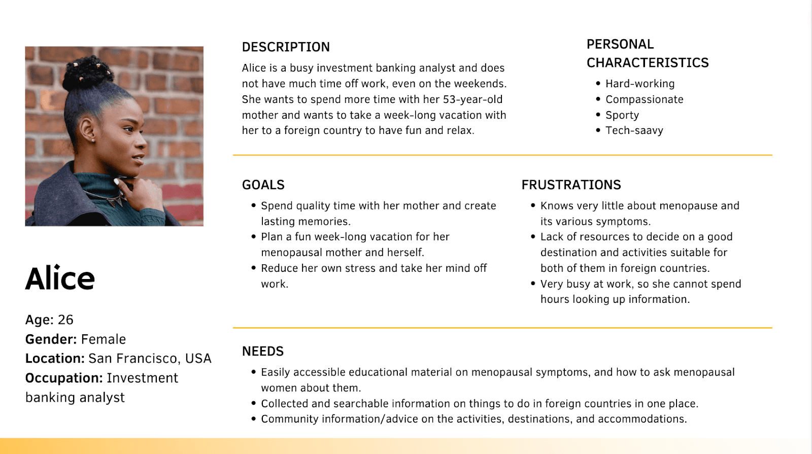
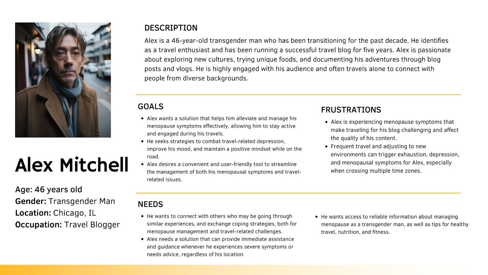
User Personas
Define
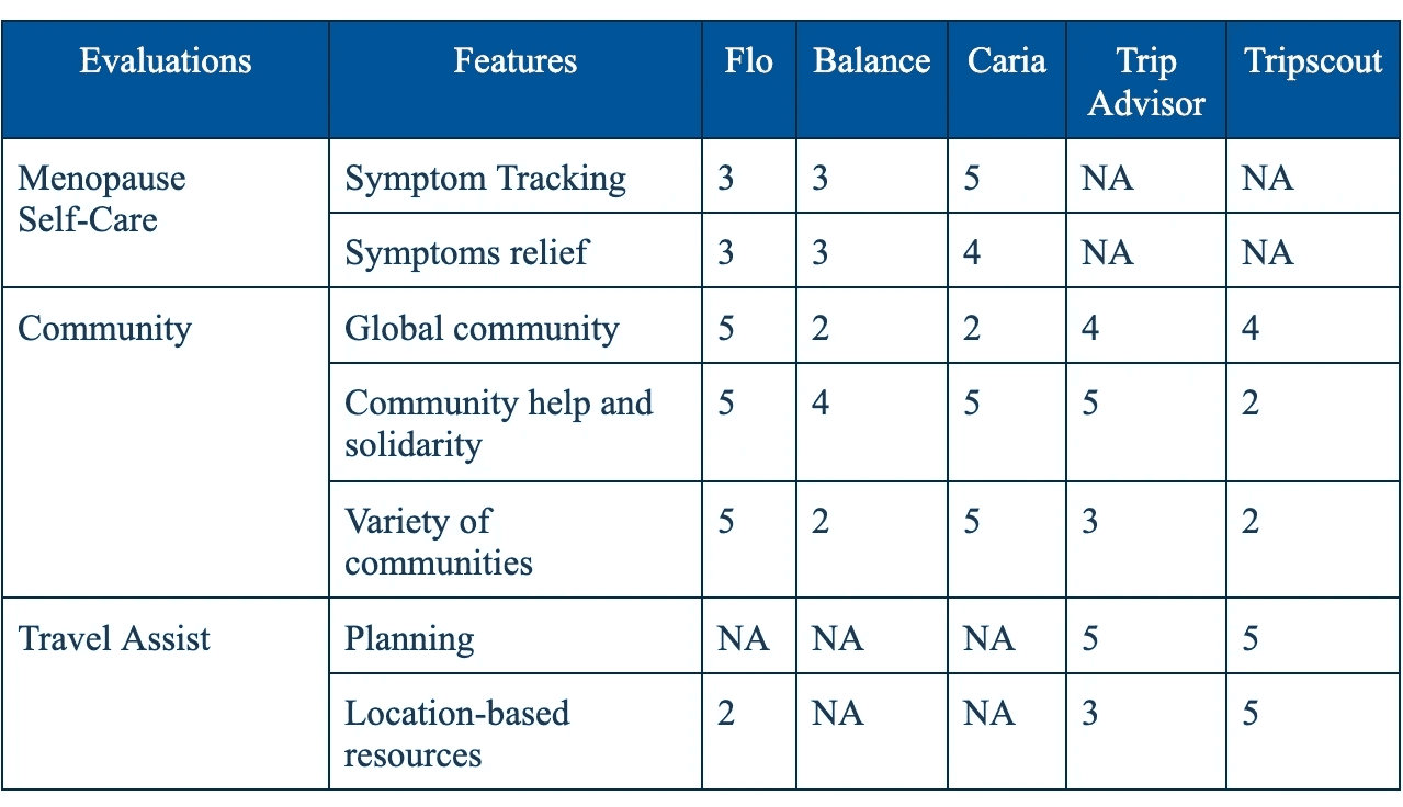
Features
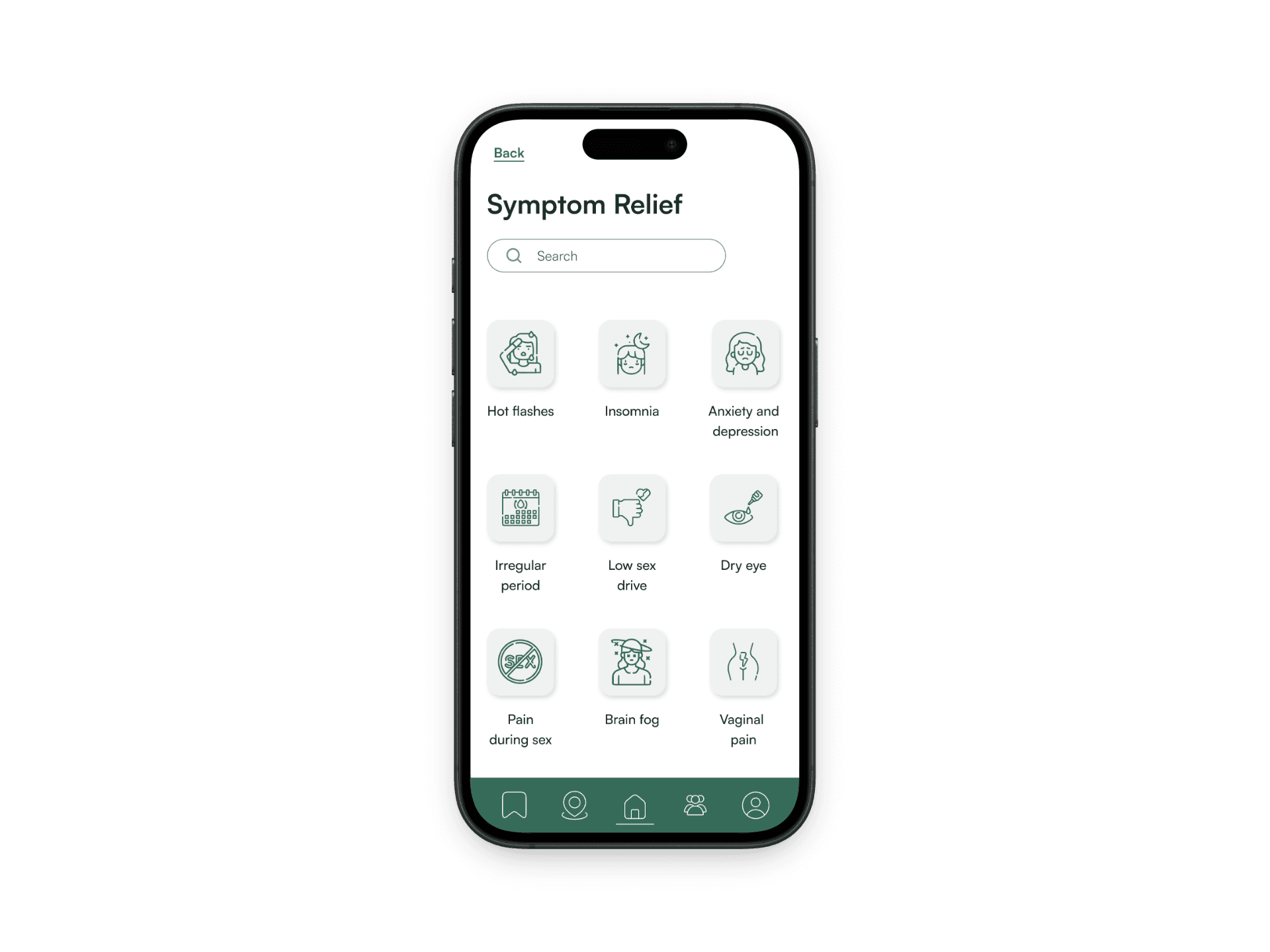
this feature was highly requested by the 4 women we interviewed in our initial interviews because managing and keeping track of symptoms is a common struggle among menopausal people.
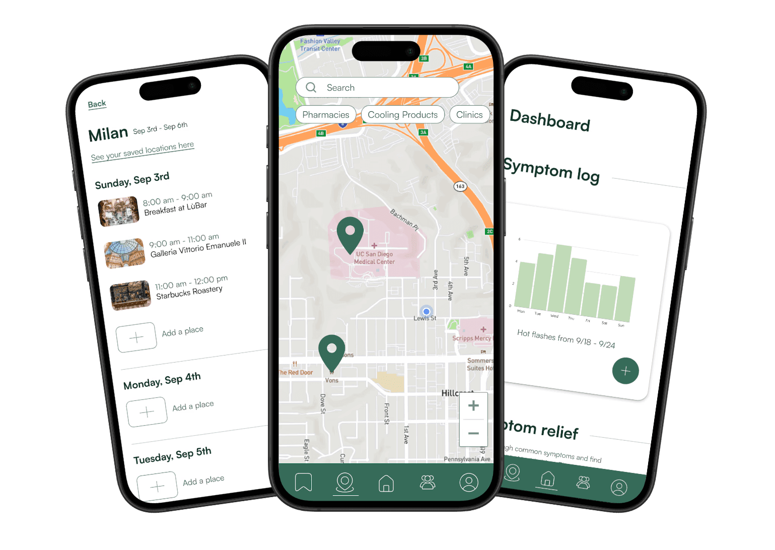
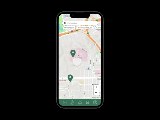
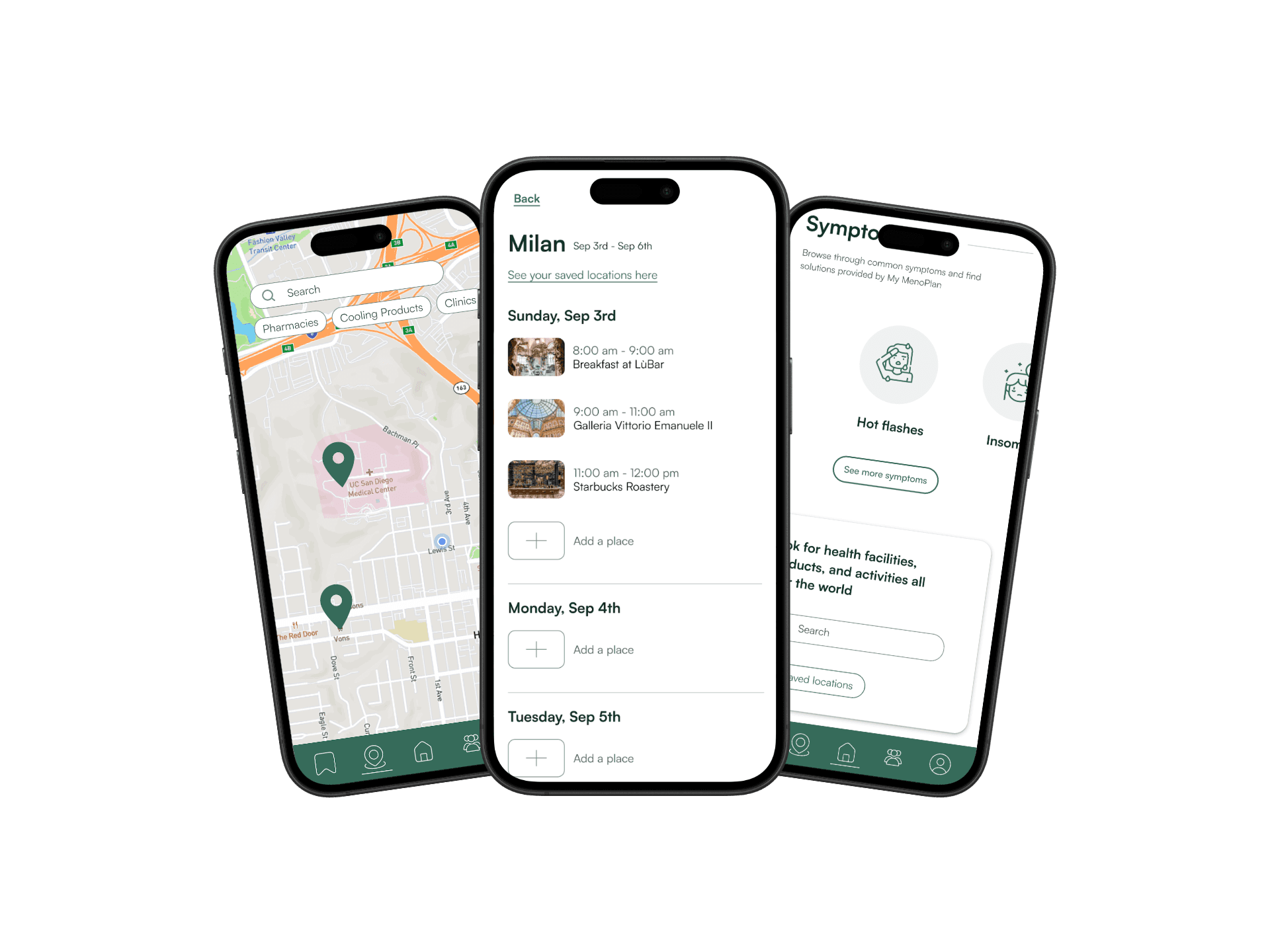
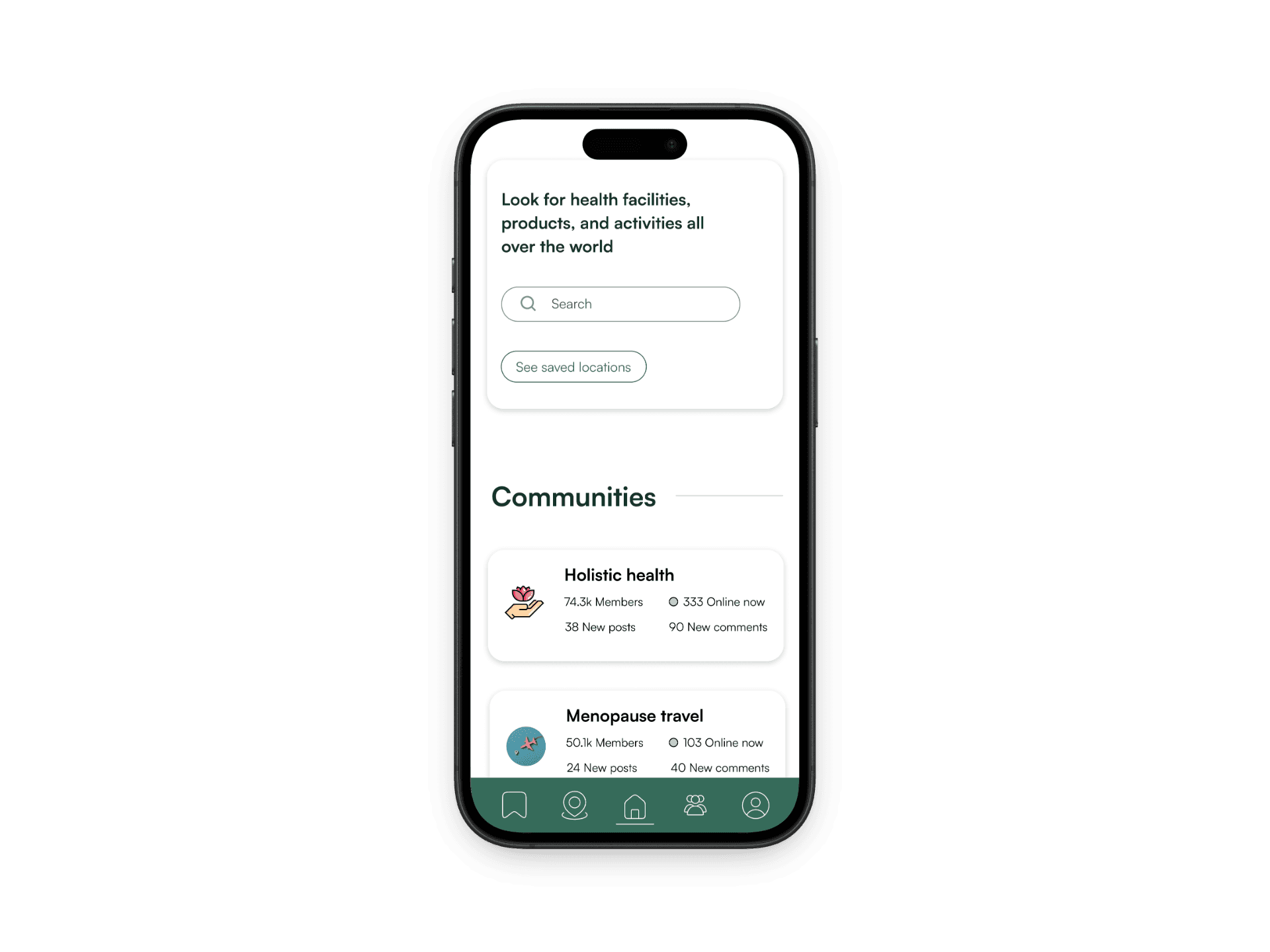
The map feature allows the users to visualize their travel plans while also keeping track of health resources near them. While users plan trips they can also prepare for emergencies by saving clinics and pharmacies near their travel plans.
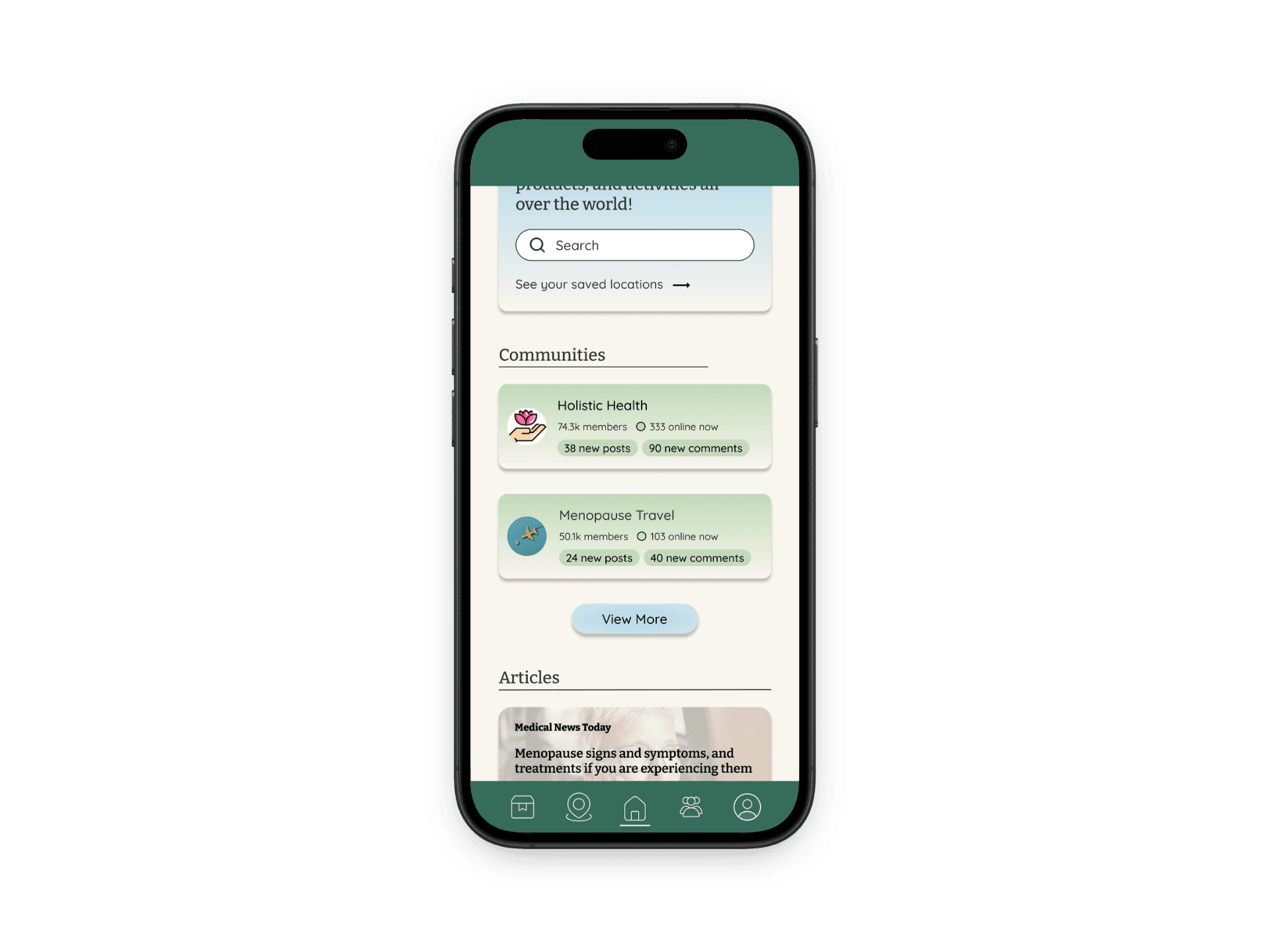
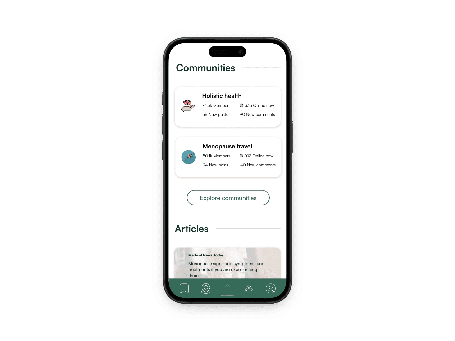
Based on our initial user interviews, many women seek community when they are going through menopause because it is a very stigmatized subject. Therefore, we wanted to create a safe space for menopausal people to share their experiences and connect with each other openly.
This feature allows users to plan their trips by the hour. Connects to the map to let users visualize their plans.
In our initial interviews, 4/4 participants reported feeling unprepared for their menopause journey due to a lack of education on the subject. We added the article section to provide educational resources and up and coming research for menopausal people who may lack education on this stigmatized subject.
Prototype 1
After some quick sketches and wire-framing, my team and I designed our first prototype. We used this prototype to conduct our first round of user testing where we received a lot of helpful feedback.
Change 1
I created a new style guide that was functional and more appealing to the eye.
5/6 of the users reported being displeased with the color scheme in the first prototype. One user described the colors on the dashboard as being "distracting from the brand image." When creating the new style guide, I used color to define a clear visual hierarchy by using more saturated colors for more important information. Additionally, I exclusively applied the brand color to interactive elements. This helps the user understand what is interactive on the page while also applying meaning and significance to the brand color.
Change 2
I replaced the "View More" buttons with copywriting that specifies a goal.
Change 3
I ensured titles were consistent from page to page
3/6 users noticed that there were typos from page to page. For example, when users clicked "Symptom relief" on the homepage, the page it led to said "Symptoms relief". To prevent errors like this from slipping through, I carefully checked the copy on every page, ensuring consistency.
This was measured by telling users to rate the usability of the prototype on a scale of 1 (very poor) to 5 (excellent). In this round of interviews, 20/20 users rated a 4 or a 5 while in the previous round only 15/20 users rated the prototype a 4 or a 5.
This was measured by asking users to “How satisfied were you with your overall experience using this prototype?” on a scale of 1 (not satisfied at all to 5 (very satisfied). In this round of interviews, 20/20 users rated a 4 or a 5 while in the previous round only 16/20 users rated the prototype a 4 or a 5.
After conducting A/B testing on the booking section of the website, 20/20 users preferred the UI of the second prototype, demonstrating my abilities to identify opportunities for growth and to follow through on those opportunities via iterative design.
Learnings
This project taught me how to incorporate brand identity into concrete design strategies, how to draw inspiration from similar and different business, and how to continuously iterate on a design to achieve maximum improvement. My professor, David Kirsh, played a large role in guiding us throughout the design process and providing us with helpful feedback.
Next Steps
Our next steps would be to find a team of developers to turn the prototype into a functioning website. Then, we would implement of SEO and online marketing strategies to increase traffic to her website. Next, we would measure the impact that the website has had on Gina's business by measuring conversion rates and bounce rates.
View other projects