MHCG
Increasing client leads with optimized user flows
Increasing client leads with optimized user flows
Skills: UI design, copywriting, user flows, SEO, Wix
Skills: UI design, copywriting, user flows, SEO, Wix
Skills: UI design, copywriting, user flows, SEO, Wix
My role
My role
UX/UI designer
UX/UI designer
Copywriter
Copywriter
Project manager
Project manager
Timeline
Timeline
March 2025 - September 2025
March 2025 - September 2025
Deliverable
Deliverable
Re-designed 30 page website
Re-designed 30 page website
Problem
Mental Health Counseling Group is a group of therapy clinics operating in 4 different areas of Texas: Sugar Land, Katy, Fulshear, and Austin. When I joined the team, their website was very compartmentalized. Each location had its own page, but all of the pages looked different and had different content. The website lacked cohesion from page to page. While in some places the design was disjointed, sometimes in an attempt to unify the locations, the locations were actually misrepresented. For example, the services page was vague, and didn’t accurately represent the services offered at each location. There also wasn’t a centralized booking page that gave users access to all of the locations.
Mental Health Counseling Group is a group of therapy clinics operating in 4 different areas of Texas: Sugar Land, Katy, Fulshear, and Austin. When I joined the team, their website was very compartmentalized. Each location had its own page, but all of the pages looked different and had different content. The website lacked cohesion from page to page. While in some places the design was disjointed, sometimes in an attempt to unify the locations, the locations were actually misrepresented. For example, the services page was vague, and didn’t accurately represent the services offered at each location. There also wasn’t a centralized booking page that gave users access to all of the locations.
Overall, the website suffered from an inability to represent the brand, MHCG, and the unique qualities of each individual location accurately.
Existing website:
Solution
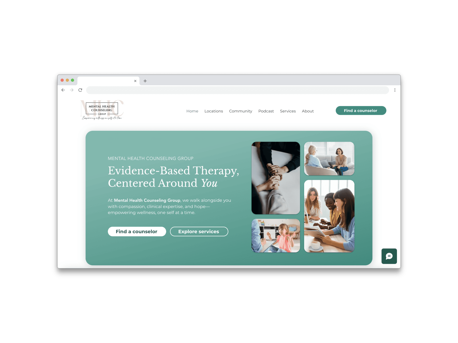
I centralized the booking process and made the CTA to book an appointment accessible from every page, so that the user always has the option to take action. I established a recognizable brand color and value proposition of providing evidence-backed techniques in their therapy rooms.
I centralized the booking process and made the CTA to book an appointment accessible from every page, so that the user always has the option to take action. I established a recognizable brand color and value proposition of providing evidence-backed techniques in their therapy rooms.


My Design Process
My Design Process
Discover
Discover
User interviews
User interviews
Competitive analysis
Competitive analysis
Client interviews
Client interviews
Define
Define
Features and functionality
Features and
functionality
User flows
Use case
summary
Deliver
Deliver
Deliver to client
Deliver to client
Test
Test
Critique sessions
Critique sessions
Design
Design
Ideation
Ideation
User flow
User flow
Wireframing
Wireframing
Prototyping
Prototyping
Discover
User interviews
Competitive analysis
Client interviews
Define
Personas
Use case
scenarios
Use case summary
Features and functionality
Deliver
Final presentation
Deliver to client
Test
Usability testing
A/B testing
Critique sessions
Design
Ideation
User flow
Wireframing
Prototyping
Discover
Define
Test
Deliver
Due to HIPAA violations, I couldn't interview actual clients of the clinic, so I chose to interview 3 people from different age groups who have all been to therapy
Due to HIPAA violations, I couldn't interview actual clients of the clinic, so I chose to interview 3 people from different age groups who have all been to therapy
Due to HIPAA violations, I couldn't interview actual clients of the clinic, so I chose to interview 3 people from different age groups who have all been to therapy
Discover
Discover
User Interviews
User Interviews
Objectives going into the research process:
Objectives going into the research process:
Objectives going into the research process:
understand what users value most throughout their counseling experience
understand what users value most throughout their counseling experience
understand what users value most throughout their counseling experience
identify specific information that users seek when booking an appointment with a new counselor
identify specific information that users seek when booking an appointment with a new counselor
identify specific information that users seek when booking an appointment with a new counselor
learn how users feel about their past experiences with booking and receiving counseling services
learn how users feel about their past experiences with booking and receiving counseling services
learn how users feel about their past experiences with booking and receiving counseling services
I conducted 3 initial interviews with 16 open ended questions
I conducted 3 initial interviews with 16 open ended questions
I conducted 3 initial interviews with 16 open ended questions
Key insights from user interviews:
Key insights from user interviews:
Key insights from user interviews:
3/3 users said that credentials are most important to them when choosing a therapist
3/3 users said that credentials are most important to them when choosing a therapist
2/3 users expressed that they would rather book through the website than calling
2/3 users expressed that they would rather book through the website than calling
2/3 users expressed that they would rather book through the website than calling
3/3 users reported that viewing the services page was important to them
3/3 users reported that viewing the services page was important to them
3/3 users reported that viewing the services page was important to them
This lead to the creation of ....
This lead to the creation of ....
This lead to the creation of ....
Define
Define
Features
Features
Features
Features
Features
Features
Requested by client
Requested by client
Requested by client
Requested by client
Requested by user
Requested by user
Requested by user
Requested by user
Blog
Blog
Blog
Blog
Services
Services
Services
Services
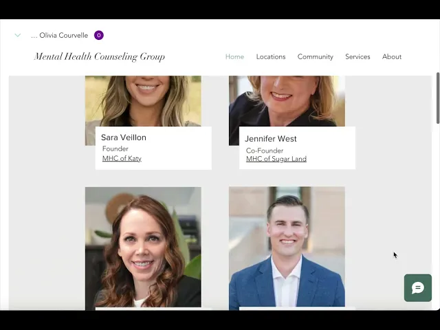
Counselor bios
Counselor bios
Counselor bios
Counselor bios
FAQ
FAQ
FAQ
FAQ
Pricing
Pricing
Pricing
Pricing
Resources
Resources
Resources
Resources
Podcast
Podcast
Podcast
Podcast
Design
Design
Challenge 1: Centralizing the booking process
Challenge 1: Centralizing the booking process
4 locations with different booking plug-ins on different pages
4 locations with different booking plug-ins on different pages
Austin
Austin
Sugar land
Sugar land
Katy
Katy
Fulshear
Fulshear
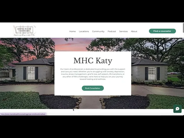
Each location had its own Simple Practice account for operational reasons, which prevented the creation of one booking plug-in. I would have liked to fully centralize the booking process on one page, but my client and I decided to prioritize the clinics' needs for their own accounts.
I worked around this by creating a booking page that led users to a location page. Once the location was chosen, they were automatically taken to the Simple Practice booking plug-in.
Ideal user flow:
Ideal user flow:
Home
Booking page
Actual user flow due to constraints:
Actual user flow due to constraints:
Home
Locations
Booking widget
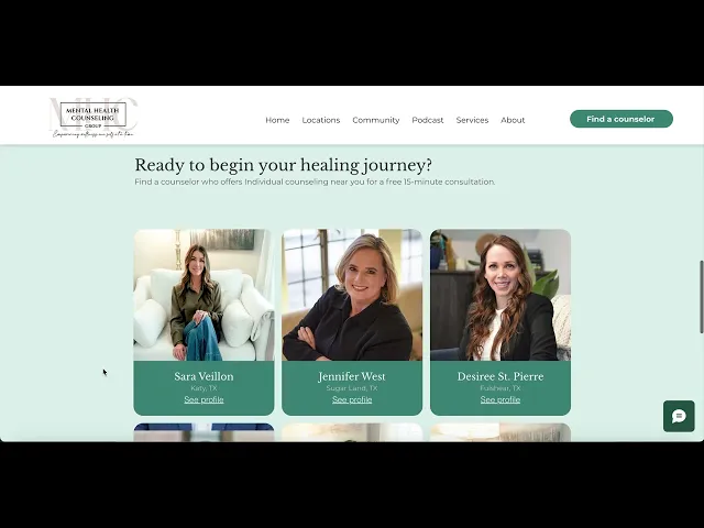
Solution:
Solution:
Design
Design
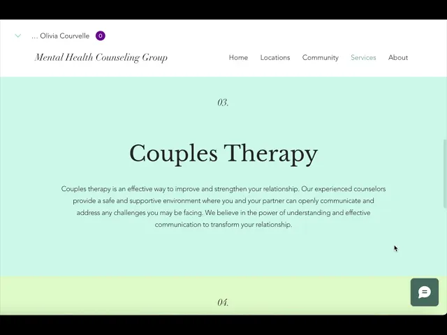
Challenge 2: Organizing services
Challenge 2: Organizing services

4 locations with different counselors,
each offering different services
4 locations with different counselors, each offering different services
4 locations with different counselors,
each offering different services
User flow
User flow
To accurately communicate each location's unique service offerings, I created pages that described the services at each categorization level, and I guided users toward the counselors who offer each service to encourage a seamless booking process. Previously, the services page was one page of brief descriptions on a few of the counseling services offered across the 4 clinics. The existing services page excluded coaching, did not guide the user towards counselors who offer specific services, and lacked specificity in its descriptions of services.
individual
Services
Counseling
Counseling
Individual
Individual
Family
Family
Kids
Kids
Adolescent
Adolescent
Group
Group
Couples
Couples
Counselors who offer this service
Counselors who
offer this service
Coaching
Coaching
Life
Life
Executive
Executive
Coaches who offer this service
Coaches who
offer this service
Services
Counseling
Coaching
Individual
Kids
Couples
Group
Adolescent
Counselors who offer this service
Coaches who offer this service
Family
Life
Executive
Solution:
Solution:
Design
Design
Challenge 3: Establishing brand identity
Challenge 3: Establishing brand identity
1
1
1
Brand color and style guide
Brand color and style guide
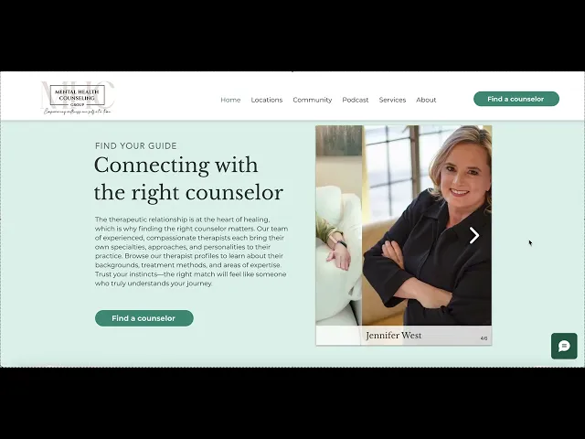
I developed a sage green color palette and applied consistent fonts and design elements throughout the site, creating a visual language that feels calm, trustworthy, and unified from page to page.
I developed a sage green color palette and applied consistent fonts and design elements throughout the site, creating a visual language that feels calm, trustworthy, and unified from page to page.
2
2
Highlighting research backed methods
Highlighting research backed methods
I crafted a value proposition that spotlighted the practice's evidence-based, research-backed methods, giving prospective clients the confidence that they'd be in capable, knowledgeable hands.
I crafted a value proposition that spotlighted the practice's evidence-based, research-backed methods, giving prospective clients the confidence that they'd be in capable, knowledgeable hands.
3
3
Solution forward messaging
Solution forward messaging
I made a deliberate choice to frame all messaging around hope and outcomes rather than leaning into pain points, because clients seeking therapy need to feel drawn forward, not defined by their challenges.
I made a deliberate choice to frame all messaging around hope and outcomes rather than leaning into pain points, because clients seeking therapy need to feel drawn forward, not defined by their challenges.
Solution:
Solution:
Test
Test
Measuring Impact
Measuring Impact
32%
32%
increase in client first-time consultation calls scheduled through the simple practice website plug-ins
increase in client first-time consultation calls scheduled through the simple practice website plug-ins
Deliver
Deliver
30-Page responsive website
30-Page responsive website

View other projects
Olivia Courvelle
Olivia Courvelle
Olivia Courvelle
Olivia Courvelle